Google Redesigns Pixel Lock Screen in Android 16 Beta: New At a Glance Widget Placement Reduces Clutter
Google is taking significant steps to enhance the user experience on Pixel devices with a revamped lock screen design in the latest Android 16 beta. The primary focus of this update is to declutter the lock screen by rethinking the placement of the popular At a Glance widget. This change aims to provide Pixel users with a cleaner, more organized interface while maintaining the functionality that has made the widget a staple of the Android experience.
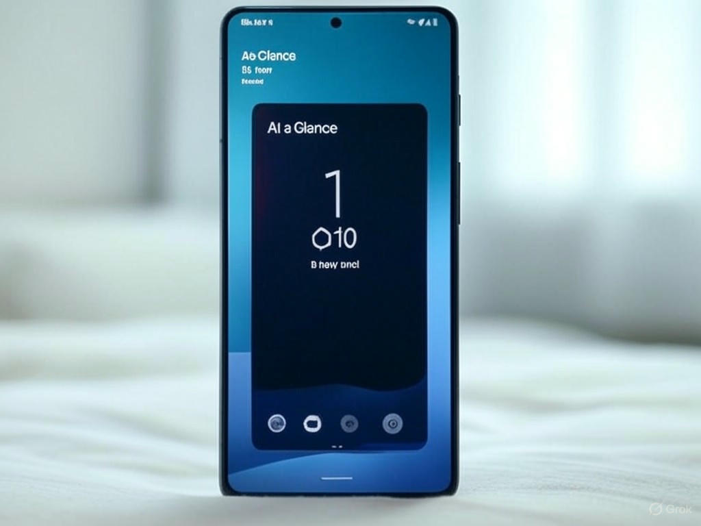
A Cleaner Lock Screen for Pixel Users
For years, the Pixel lock screen has been a hub for quick information, thanks to the At a Glance widget. This feature displays essential details such as weather updates, upcoming calendar events, and notifications at a glance. However, as more features were added, the lock screen began to feel overcrowded, making it harder for users to focus on the most critical information. In response to user feedback, Google is experimenting with a new layout in the Android 16 beta that promises to streamline the lock screen experience.
Recent reports, including leaks from just 14 hours ago, reveal that Google is testing a repositioned At a Glance widget. While specific details about the new placement are still emerging, early previews suggest that the widget will be moved to a less obtrusive area of the lock screen. This shift is designed to reduce visual clutter, allowing users to access key information without feeling overwhelmed by overlapping elements or excessive notifications.
Why This Change Matters
The lock screen is often the first interaction users have with their devices, making its design crucial for a seamless user experience. A cluttered lock screen can lead to frustration, as users may struggle to locate important notifications or unlock their devices quickly. By repositioning the At a Glance widget, Google aims to strike a balance between functionality and simplicity, ensuring that Pixel users can enjoy a more intuitive and visually appealing interface.
What to Expect in Android 16
While the Android 16 beta is still in its early stages, this lock screen redesign is a promising glimpse into Google’s vision for the future of Pixel devices. The updated layout is expected to roll out to more users as the beta testing phase progresses, with potential refinements based on user feedback. Additionally, Google may introduce customization options, allowing users to adjust the position or visibility of the At a Glance widget to suit their preferences.
This update aligns with Google’s broader goal of improving Android’s user interface by prioritizing clarity and efficiency. As Pixel phones continue to compete in a crowded smartphone market, small but impactful changes like this lock screen redesign could set them apart by offering a more polished and user-friendly experience.
Conclusion
Google’s decision to reposition the At a Glance widget in the Android 16 beta reflects its commitment to refining the Pixel user experience. By tackling lock screen clutter, the company is addressing a common pain point for users, paving the way for a cleaner and more functional design. As more details about the update emerge, Pixel owners can look forward to a lock screen that not only looks better but also enhances their daily interactions with their devices. Stay tuned for further updates on Android 16 and its exciting new features as Google continues to innovate in the smartphone space.
Leave a Reply