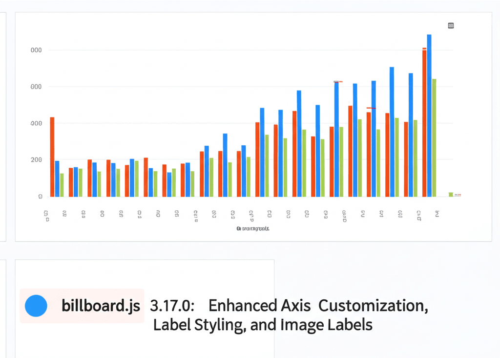
The latest release of billboard.js, version 3.17.0, introduces a suite of powerful features designed to give developers unprecedented control over chart visualizations. This update focuses on axis customization, label styling enhancements, and the innovative addition of image labels, making data representation more intuitive and visually engaging.
One of the standout features in this release is the support for image labels. This allows developers to use icons, logos, or custom images as labels, transforming how data is presented. Whether you are working with bar charts, line charts, or specialized chart types like donut, pie, polar, or gauge charts, image labels can be implemented seamlessly. The newly added options include data.labels.image, donut.label.image, gauge.label.image, pie.label.image, and polar.label.image. By simply specifying the image URL and dimensions, you can integrate visual elements that make charts more accessible and informative.
Axis customization has also received significant improvements. Developers can now fine-tune inner axis ticks, adjust label backgrounds dynamically using functions, and apply border styles to labels. These enhancements provide greater flexibility in aligning chart aesthetics with brand guidelines or specific design requirements. The ability to dynamically style labels based on data values or conditions opens up new possibilities for creating interactive and responsive visualizations.
Label styling features extend beyond mere cosmetic changes. With dynamic background functions, labels can adapt their appearance based on real-time data changes, making charts more interactive and user-friendly. Border options for labels add a layer of polish, ensuring that text remains legible even against complex backgrounds. These styling capabilities are complemented by robust axis customization tools, allowing for precise control over tick placement, label orientation, and overall chart layout.
For those working with circular chart types, such as donut, pie, polar, and gauge charts, the image label feature is particularly impactful. It enables the use of visual cues like icons or emblems to represent data points, reducing reliance on text and making charts easier to interpret at a glance. This is especially useful in dashboards, reports, or applications where space is limited, or where visual consistency is key.
Implementation is straightforward. Developers can reference the comprehensive documentation and demo examples available on the official billboard.js website. The demos showcase practical applications of image labels across various chart types, providing code snippets and configuration options that can be adapted to specific use cases. By leveraging these resources, you can quickly integrate these new features into your projects.
In addition to the core features, this release includes numerous under-the-hood optimizations and bug fixes, ensuring smoother performance and greater reliability. The billboard.js community has played a vital role in shaping this update, with many of the new features being direct responses to user feedback and requests.
Overall, billboard.js 3.17.0 represents a significant step forward in data visualization capabilities. The combination of image labels, advanced axis customization, and enhanced label styling options empowers developers to create more engaging, informative, and aesthetically pleasing charts. Whether you are building analytics dashboards, financial reports, or interactive web applications, these tools provide the flexibility and control needed to deliver exceptional user experiences.
To explore these features in depth, visit the official demos and documentation. The examples provided illustrate the practical benefits and ease of implementation, helping you get started quickly. With billboard.js 3.17.0, data visualization becomes not just functional, but truly transformative.
Leave a Reply