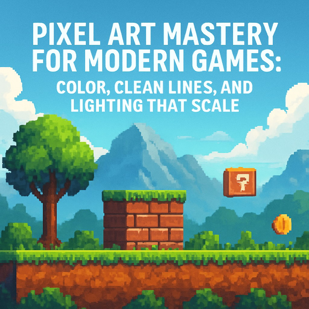
Pixel art remains one of the most recognizable visual languages in 2D game development. It is not simply “low resolution” artwork. It is a deliberate craft where every pixel choice affects readability, motion clarity, and production speed. For developers building games in engines such as Unity, Unreal Engine, Godot, or Defold, strong pixel art foundations support a consistent visual identity across sprites, tiles, UI elements, and animations.
This guide focuses on practical mastery: selecting color palettes that stay harmonious, drawing clean outlines without common edge artifacts, and implementing shading that makes game characters and environments look grounded and professional. It also explains how modern tooling, including palette-driven workflows and automation features such as AI-assisted sprite generation (for example, AutoSprites-like approaches), can reduce repetitive decisions while keeping artistic control.
Start with a Color Palette Strategy, Not Just “Nice Colors”
Many beginner workflows treat color picking as a one-time step. Pixel art requires the opposite approach: colors must behave consistently across multiple assets. A strong palette design helps every sprite material appear cohesive under the same lighting rules.
A widely used baseline for pixel art materials is a three-shade structure:
- Base color (the main pigment)
- Shadow (the darkest form used to define volume)
- Highlight (the brightest accents that clarify shape and edges)
When these three roles are defined within a palette, the game’s art direction becomes easier to maintain. Even during rapid iteration, sprites remain visually unified. This matters for large projects where different characters, props, and tilesets must look like they belong to the same world.
How automation can help without breaking consistency
Palette-driven automation tools can speed up development by enforcing consistent color harmony across assets. Instead of re-tuning colors every time a new sprite is created, developers can select a pre-made palette and reuse it as the project standard. AI-generated or assisted sprites can then maintain palette rules so that newly created elements match existing ones.
Practical takeaway: Treat the palette as part of the game’s “system,” similar to how code uses shared constants. A consistent palette reduces visual drift.
Clean Lines and the Problem of “Doubles”
Clean silhouettes and crisp edges are essential in pixel art. One of the most common beginner mistakes is producing extra edge pixels along outlines, often described as “doubles.” Doubles can make shapes appear thick, uneven, and visually noisy, especially when sprites are viewed at small sizes or during animation.
What to do instead
To achieve sharper pixel-perfect lines:
- Use pixel-perfect drawing tools designed for strict grid placement, so edge pixels land exactly where intended.
- Keep curves controlled so transitions between edge angles feel intentional, not accidental.
- Use symmetry patterns for balanced curves and forms. A commonly helpful sequence is: 1-1-2-3-2-1-1. This pattern guides how the eye travels across the outline and reduces lopsided curvature.
When doubles are eliminated, outlines become more stable during motion. That stability improves readability for fast gameplay and helps the character “read” instantly, even in busy scenes.
Professional Lighting and Shading That Holds Up in Motion
Lighting in pixel art is not decoration. It is structure. Even simple scenes feel more believable when shadows and highlights communicate the same volume rules across every frame of animation.
Core shading principles
- Choose one light direction and apply it consistently. If a character’s highlight sits on the upper-left in one sprite, it should behave similarly in related poses.
- Use shadow to define form, not to “darken everything.” Shadows should follow the geometry of the shape.
- Use highlights to clarify edges and catch attention where the form turns toward the light.
- Respect the pixel grid. Avoid gradients that fight the discrete nature of pixel art unless the project intentionally uses that style.
In production, shading quality matters most where players focus: character faces, weapon edges, hands, key environmental landmarks, and UI elements. Consistent shadow and highlight placement improves depth perception even at small resolutions.
A Practical Workflow for Developers Building a Pixel Art Pipeline
Modern game teams often need speed without sacrificing visual quality. A robust workflow typically includes:
- Lock a palette early and reuse it across the asset pipeline.
- Draw outlines with pixel-perfect tools and check silhouettes at final scale.
- Apply a repeatable shading rule (base-shadow-highlight) and keep light direction consistent.
- Use automation for consistency, especially for palette mapping and variant generation, so new assets match established art direction.
When these steps are followed, pixel art stops being an artisanal bottleneck and becomes a scalable production system. Sprites remain readable, animations look cleaner, and the game’s visual identity holds together across levels and content updates.
Quick Checklist Before Shipping Assets
- Do materials use a consistent base-shadow-highlight scheme?
- Are outlines free of doubles and stray edge pixels?
- Does lighting direction remain consistent across poses and frames?
- Is the palette applied uniformly across characters, props, and tiles?
- Does the sprite remain readable at the in-game scale and during movement?
Pixel art mastery is less about memorizing techniques and more about building repeatable rules. With disciplined palettes, clean outlines, and reliable shading logic, modern game developers can produce 2D visuals that look intentional, professional, and consistent across the entire project.
Leave a Reply