Discover the professional techniques to make your GitHub logos and images automatically switch between light and dark themes. This comprehensive guide covers both GitHub-native solutions and universal web standards to ensure your README files, documentation, and project pages look perfect in any display mode.

Why Adaptive GitHub Images Matter
With over 70% of developers using dark mode interfaces, maintaining optimal contrast for logos and diagrams is crucial. Using theme-appropriate images enhances readability, preserves brand consistency, and demonstrates attention to detail. GitHub automatically applies dark mode based on user preferences, so your content should adapt accordingly.
Method 1: GitHub-Specific URL Fragment (Markdown Native)
GitHub’s proprietary solution offers the simplest implementation for theme-specific images in README files and Markdown content. By appending specialized URL fragments, you can specify different assets for light and dark modes.
Implementation Steps
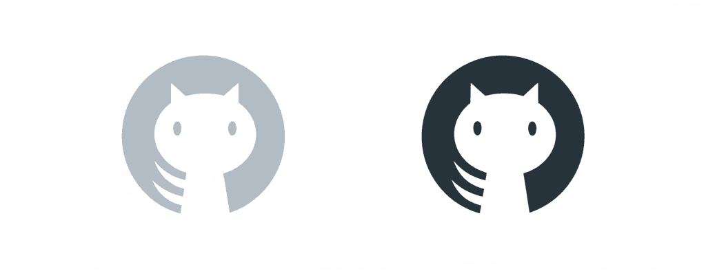
- Create two image versions: light-theme.png (white background) and dark-theme.png (dark background)
- Upload both images to your repository or CDN
- Add both image declarations in consecutive lines of Markdown:

Advantages
- Zero CSS/HTML Knowledge Required: Perfect for Markdown purists
- Native GitHub Support: Optimized rendering on GitHub’s platform
- Backward Compatible: Falls back gracefully on unsupported clients
Limitations
- Platform-Specific: Only works within GitHub’s ecosystem
- No Media Query Control: Cannot respond to OS-level theme changes
Method 2: Universal HTML Picture Element (Advanced)
The W3C-standard <picture> element provides cross-platform compatibility for theme-dependent images, working across GitHub Pages, GitLab, and static sites.
Complete Implementation
<picture>
  <!-- Dark mode detection -->
  <source
    srcset="https://yourdomain.com/dark-theme-logo.png"
    media="(prefers-color-scheme: dark)"
  >

  <!-- Light mode default -->
  <img
    src="https://yourdomain.com/light-theme-logo.png"
    alt="Project Logo Description"
    style="max-width: 300px;"
  >
</picture>
Key Benefits
- Cross-Platform Functionality: Works on any modern browser or platform
- OS-Level Integration: Responds to system-wide dark mode settings
- Extended Customization: Supports additional media queries (resolution, viewport size)
Implementation Tips
- Always provide descriptive alt text for accessibility
- Host images via GitHub Pages or CDN for reliable delivery
- Test with forced color schemes in browser DevTools (Chrome: Rendering > Emulate CSS media)
Comparison: GitHub Fragments vs Picture Element
| Feature | GitHub Fragments | Picture Element |
|---|---|---|
| GitHub Compatibility | ✅ Full Support | ✅ Full Support |
| External Platforms | ❌ Only GitHub | ✅ All platforms |
| Mobile Rendering | ✅ Optimized | ✅ Responsive |
| Accessibility | Basic | Advanced Controls |
Troubleshooting Common Issues
- Images Not Switching: Clear browser cache and GitHub’s CDN cache by appending ?v=2 to URLs
- FOUC (Flash of Unstyled Content): Ensure images are similarly dimensioned
- GitHub Readme Rendering: Verify both source images are publicly accessible
Best Practices for Theme-Aware Images
- Maintain identical aspect ratios between light/dark variants
- Use SVG format for resolution-independent rendering
- Include 1px transparent borders on light images for dark backgrounds
- Test in both forced light/dark modes (GitHub > Profile > Appearance Preferences)
Advanced Technique: CSS Variables (GitHub Pages)
For Jekyll-based GitHub Pages sites, leverage CSS custom properties:
<style>
  :root {
    --logo-url: url(light-logo.png);
  }

  @media (prefers-color-scheme: dark) {
    :root {
      --logo-url: url(dark-logo.png);
    }
  }
</style>

<div class="logo" style="background-image: var(--logo-url)"></div>
Conclusion
Implementing theme-responsive images significantly enhances your GitHub presence’s professionalism and accessibility. For pure GitHub projects, start with the fragment method for its simplicity. For cross-platform documentation or portfolio sites, the picture element offers greater flexibility. Combine these techniques with optimized image assets to create visually consistent displays across all user preference scenarios.
")
Leave a Reply